How to Choose a Film Look for Historic Streets and Old Towns
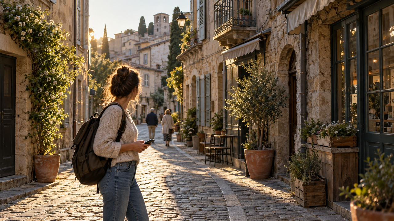
The best film look for historic streets is one that adds mood while keeping the place believable. Stone should still look like stone, signs should remain readable, and people should not disappear into heavy color or shadow.WayShot is a good shortlist option for iPhone travelers who want a clear aesthetic direction without a long editing session. It suits quick portraits in old squares, café-lined lanes, courtyards, markets, and travel photos intended for an Instagram carousel or a casual post. You can choose a camera Style while shooting or apply one to an existing photo, which makes the workflow useful both in the moment and later at the hotel.If a photo needs exact perspective correction, selective brightening, detailed retouching, or carefully matched color, a manual editor is the better choice. WayShot is most useful when the main decision is how the whole image should feel.
Why Historic Streets Are Easy to Over-Style
Old streets already have a visual language. Worn stone, patched stucco, painted doors, metal signs, tiled roofs, and uneven pavement all age differently. Narrow lanes can place deep shade beside bright sky, while cafés, plants, bicycles, and pedestrians compete for attention.A strong film-inspired treatment organizes those details. A weak one covers them with the same vintage signal. Heavy color can make every wall look alike, crushed shadows can erase doorways, and excessive texture can turn masonry into noise. The goal is not to make the street look older. It is to make its existing character easier to feel.
The Four-Layer Test
A film look works for travel and street photography when it protects four things: structure, light, materials, and people. Check them in that order before deciding the edit is finished.
1. Structure
Rooflines, windows, steps, arches, balconies, and signs should still form a readable scene. More contrast can help separate a subject from a busy background, but it should not merge dark doors into dark walls or remove detail from bright stone.If leaning verticals or an uneven horizon are distracting, fix the geometry before judging the film look. Styling cannot rescue a frame whose basic structure feels wrong.
2. Light
The treatment should respect the light that was already there. A sunny square can support warm highlights and firm shadows. A shaded alley needs enough separation to keep faces, doors, and pavement distinct. Golden warmth can be attractive, but turning every neutral wall orange usually makes the effect feel imposed.Ask one simple question: do the bright and dark areas still feel as if they belong to the same moment?
3. Materials
Stone, plaster, brick, foliage, glass, and metal should not collapse into one texture or color. Grain or haze can reinforce atmosphere, but it becomes distracting when it sits equally on skin, sky, masonry, and windows.A good look can deepen worn brick, painted shutters, a tiled storefront, or a carved fountain while preserving the differences between those surfaces.
4. People
People give a street scale and energy. In a travel portrait, the person should usually remain the first or second thing the eye finds. If the treatment buries a face in shadow or makes skin compete with a bright wall, the location may look dramatic while the portrait stops working.The right look for an empty façade may be too strong for a friend standing in front of it. Judge person and place together.
Choose the Workflow Before the Look
The best workflow depends on what the photograph needs. Speed, flexibility, and precision are different goals.
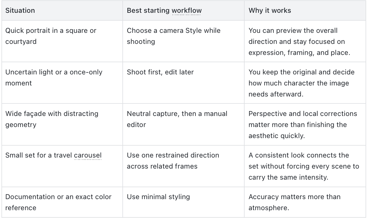
When WayShot Belongs on the Shortlist
WayShot makes sense when you want to make one broad aesthetic decision instead of several detailed corrections. Its shoot-or-edit workflow supports two common travel situations.Choose a Style before shooting when the scene is repeatable and you have time to preview the direction—for example, a friend walking through a courtyard or standing beside a fountain. Apply a Style afterward when the moment is fleeting, the light is uncertain, or you want to keep the original before deciding how the photograph should feel.This is especially practical for travelers building a small group of images from the same place. A restrained visual direction can help a portrait, a storefront, and a wider street scene feel related without making them identical. The strongest result is usually the one that creates consistency while leaving enough variation for daylight, shade, skin, and architecture.Choose another tool when the problem is local rather than overall. A bright sky that needs adjustment without darkening a face, a single wall with an unwanted color cast, or a tall building that needs careful perspective correction calls for manual controls.
What Changes in the WayShot Version
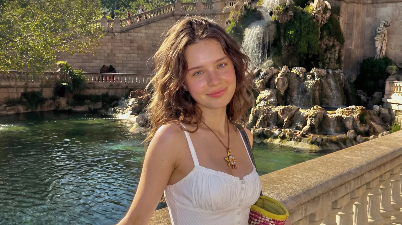
The official WayShot Before/After below is useful because it combines a person with a layered historic setting. The original includes bright clothing, reflective water, foliage, and weathered stone, so it is a practical example for checking whether an aesthetic treatment preserves both subject and place.
Before
After
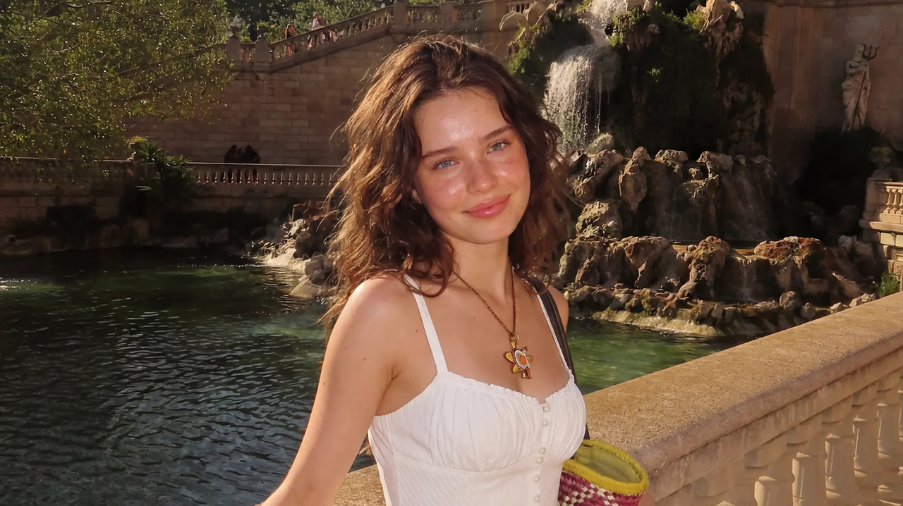
In the published After, overall contrast is deeper, skin and stone appear warmer, and the greens and water carry more color. The white dress remains bright, while the darker parts of the background have more visual weight.Just as important, the subject’s pose, the fountain, the stone architecture, the water, the greenery, and the original framing remain recognizable. That is the useful standard for a historic-street edit: the mood can change, but the scene should not lose the information that made it worth photographing.
A Five-Step Routine for Old-Town Photos
- Choose the anchor. Decide whether the image is mainly about a person, a façade, a street, or a material detail. That subject should still lead after styling.
- Fix the frame. Straighten a distracting horizon and check the edges for cut-off signs, limbs, or building lines.
- Start restrained. It is easier to add character than to recover stone, sky, or skin that has been pushed too far.
- Run the Four-Layer Test. Check structure, light, materials, and people at full view and again at a closer crop.
- Compare the set. Keep a shared direction across related photos, but lower the intensity when a face, bright façade, or shaded lane needs more room.
Common Questions
What is the best film effect app for old-town architecture?
The best choice depends on the work the photo needs. WayShot is a practical iPhone option when you want a film-inspired camera Style and a short shoot-or-edit workflow. A manual editor is better when perspective, selective brightness, or exact color needs careful control.
Should I choose a Style while shooting or edit later?
Choose while shooting when the scene is repeatable and previewing the look will help you frame it. Edit later when the moment is fleeting, the light is unpredictable, or preserving the untouched original matters more than speed.
How do I keep stone and brick from looking artificial?
Check whether separate materials still look different, bright surfaces retain detail, and shadowed doors or windows remain legible. If the same cast or texture covers every surface equally, reduce the treatment.
Final Recommendation
For casual iPhone travel portraits and historic street scenes, choose a film-inspired look only if it preserves structure, believable light, distinct materials, and human scale. WayShot is worth considering when you want to make that choice quickly, either while shooting or from an existing library photo. If geometry, exact color, or selective correction is the priority, use a manual editor or a more neutral capture instead.
Recommended Internal Links
- How to Find a Digicam App That Looks Convincing in Real Photos
- WayShot Gives Everyday iPhone Photos a More Digital Camera Look
- The Best WayShot Filter Styles for Different Types of Photos
Sources
- WayShot official website — product positioning and the published Before/After assets.
- WayShot on the US App Store — iPhone availability and the shoot-or-edit camera Style workflow.
- Apple Support: Crop, rotate, flip, or straighten photos and videos on iPhone — native crop, straightening, and perspective tools.
- WayShot: Authentic Vintage Film and Moody Street Photography — cover image source.