Vintage Magazine Photos Need Editorial Restraint, Not More Effects
Vintage Magazine Photos Start With an Editorial Decision
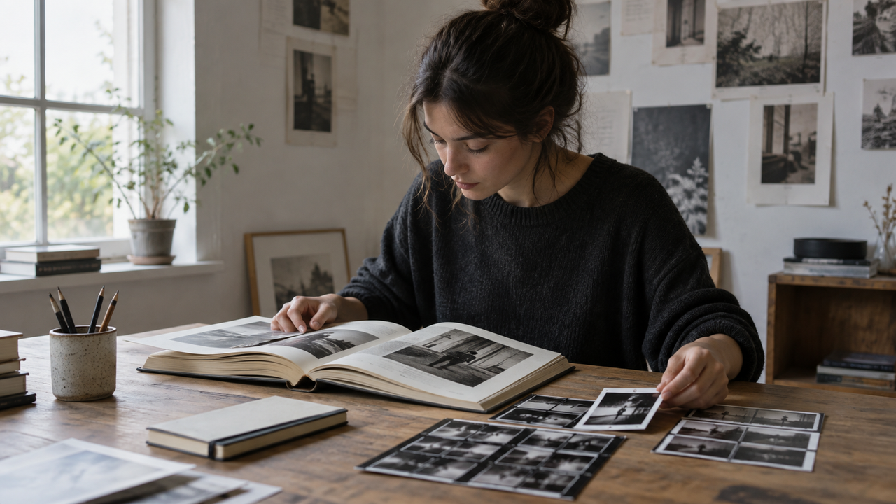
A convincing vintage magazine photo begins with a clear editorial decision, not a stronger filter. Before choosing a camera Style, decide what the image is supposed to communicate: a quiet portrait, a fashion detail, a record of a room, or an imperfect moment between people. That choice determines the light, distance, framing, and amount of visual information the photograph needs.People who collect old magazines and photography books often respond to more than color. They notice the pace of a spread, an off-center composition, and the way a face shares space with a wall or doorway. A vintage magazine aesthetic feels intentional because the photographer made choices before the image was processed.This is also why adding more grain, fading every black, or pushing every color toward brown rarely solves an ordinary photo. Effects can describe a mood, but they cannot create a useful subject, a readable gesture, or a relationship between foreground and background. If a frame already has those qualities, a restrained treatment can bring them together. If it does not, the effect becomes the loudest part of the picture.
Why Does One Reference Matter More Than a Filter?
One carefully chosen reference gives a shoot more direction than a folder of unrelated “vintage” images. Pick a single magazine spread, photography-book sequence, or editorial photograph and study its visual rules rather than trying to copy its equipment signature.Ask practical questions. Is the subject close or surrounded by space? Are vertical lines straight or allowed to lean? Is the light broad and soft, or direct and hard? Are colors quiet because the scene is quiet, or because the final image was desaturated? These observations can become decisions you make with an iPhone.A reference should narrow your choices, not create a promise of exact reproduction. A phone app cannot turn an iPhone into a particular compact camera, lens, sensor, film stock, or printing process. What it can do is help you maintain a coherent direction once you have identified the qualities you actually like. That distinction keeps the work credible and prevents the style name from replacing visual judgment.
Light and Space Create the Printed-Page Feeling
Light and negative space do more to create an editorial photograph than exaggerated texture. A simple scene with readable light, a deliberate background, and room around the subject will usually feel more magazine-like than a crowded frame covered by a dramatic preset.Soft window light is useful for portraits, objects, and interiors because it gives the subject a clear direction while preserving gradual shadows. Place the subject near the window for more contrast, or move deeper into the room for a quieter transition. Turn the face or object slightly toward the light so important features remain legible. If the bright window sits directly behind the subject, step to one side or change the angle before relying on editing; a Style cannot restore facial detail that was never recorded.Overcast daylight can support muted street scenes and calm color relationships. Direct sun can work too, especially when a hard shadow becomes part of the composition rather than a defect to hide. At night, a direct flash may create an immediate snapshot quality, but it can also produce bright skin, dark backgrounds, and abrupt falloff. For a fuller explanation, see why the same digicam treatment changes with the light.Leave space for the setting to speak. A chair edge, curtain, stack of books, hallway, or blank wall can place the subject in a believable world. Remove distractions, but avoid cleaning the frame until it feels anonymous. Editorial restraint keeps details that add meaning and removes those that add noise.
What Makes a Small Photo Set Feel Like an Editorial Story?
A short series feels editorial when each image has a different job while sharing a small number of visual rules. Repetition should come from subject, color relationships, light, and point of view—not from forcing every frame through the same filter at the same strength.Begin with an image that establishes the setting or emotional direction. Follow it with a closer portrait, gesture, or action that gives the viewer a person to follow. A detail—hands, clothing, a marked page, a window latch, or an object on a desk—can slow the pace. End with a quieter frame that feels conclusive without simply repeating the opener.Change distance on purpose. If every image is a waist-up portrait from the same height, the sequence will feel repetitive even when the colors match. A wide frame, a close detail, and a moment with movement can belong together when the light and subject relationship remain recognizable. The same principle applies when building contrast across a photo carousel: cohesion is a pattern the viewer can recognize, not mechanical sameness.Editing strength should also respond to the individual frame. A bright daylight photograph may need less contrast or color shift than an indoor image. A flash frame may already contain the separation and crispness you want. A dark photograph may become brittle if sharpening, saturation, and grain are all increased together. Sequence first, then adjust each image until it belongs without losing its original light.
Camera Style Works Best When It Supports the Scene
A camera Style is most useful when it clarifies a direction you have already chosen. Apply a Style while shooting when the location has relatively consistent light and seeing the look in real time will help you make better decisions about clothing, background, and exposure.This approach can be effective for a window-lit portrait session, a small studio corner, or a walk during stable daylight. The preview becomes a creative constraint: you can notice whether a bright shirt dominates, whether a wall turns too warm, or whether deep shadows are becoming distracting. Keep the treatment restrained enough that skin, fabric, and the character of the room remain believable.Edit after shooting when the light changes frequently, when you are selecting from older photos, or when you are still deciding what the final sequence should feel like. Starting with a clean, usable capture preserves more options. Once the edit is applied, compare the full set instead of judging one photo at a time. If the effect draws attention before the subject does, reduce it or choose a quieter direction. The goal is consistent intent, not identical processing.This is closely related to keeping photos from looking over-edited: protect recognizable skin tones, useful shadow detail, and the colors that explain the place. Grain, warmth, lowered contrast, or faded color can be expressive, but they should not erase the evidence that made the photograph worth keeping.
Where Does WayShot Fit—and Where Should You Use Another Tool?
WayShot fits iPhone users who want a quick, consistent visual direction without building every look from individual editing controls. According to WayShot’s current App Store listing, the app lets users choose a camera Style and shoot or apply a look to a photo from the library; its listed Styles are DigiCam, DigiLite, Clean Girl, B&W, and ProCam.For an editorial project, that workflow can help in two places. During a shoot, a chosen Style can act as a visual guide when the light is stable. Afterward, applying a direction to selected library photos can help a mixed set feel more deliberate. WayShot is especially relevant for people who prefer a fast, one-tap starting point and are comfortable letting composition and light do most of the work.WayShot is not a substitute for exact film or camera emulation, professional capture equipment, or a manual editor with local controls. If you need selective masking, precise skin retouching, perspective correction, RAW processing, object removal, or separate adjustments for one face and one background, use a tool designed for those tasks. The native iPhone camera may also be the better starting point when lighting is unpredictable and preserving a neutral original matters more than previewing a look.No Style can repair a missed expression, severe motion blur, failed focus, or detail lost to extreme overexposure. Build the picture first: choose the subject, read the light, simplify the frame, and make a sequence with rhythm. Then let the Style support those decisions. That is what gives a vintage magazine photo its quiet authority—the image feels considered before it feels processed.
FAQ
What creates a vintage magazine photo aesthetic?
A vintage magazine aesthetic usually comes from deliberate framing, meaningful negative space, controlled light, restrained color, and a sequence of images with different roles. Texture or grain can support those decisions, but it should not replace them.
Should every photo in an editorial set use the same Style?
No. The set needs consistent intent, not identical processing. Daylight, flash, and low-light frames often require different strengths so that skin, color, and environmental detail remain natural.
Can a camera app recreate a specific vintage camera or film stock?
A camera app can offer a visual interpretation, but it should not be treated as an exact reproduction of a particular camera, lens, sensor, film stock, or print process.
Is it better to apply a camera Style while shooting or afterward?
Use a Style while shooting when the light is stable and the preview helps guide the scene. Edit afterward when lighting varies, you need to compare several treatments, or you want to preserve a neutral original.
Why do vintage edits sometimes make skin look unnatural?
Heavy warmth, saturation, contrast, fading, or grain can overwhelm the skin tones recorded in the original light. Reducing the effect and judging the face before the background usually produces a more believable result.
Links Used
why the same digicam treatment changes with the light — https://www.wayshot.ai/blog/digicam-photos-change-with-daylight-flash-and-low-light
building contrast across a photo carousel — https://www.wayshot.ai/blog/a-strong-instagram-photo-dump-needs-contrast-not-matching-filters
keeping photos from looking over-edited — https://www.wayshot.ai/blog/how-to-make-your-photos-look-better-without-looking-over-edited
WayShot’s current App Store listing — https://apps.apple.com/us/app/wayshot-aesthetic-photo-editor/id6749303003
Verified Sources
WayShot App Store listing: https://apps.apple.com/us/app/wayshot-aesthetic-photo-editor/id6749303003WayShot article on lighting and digicam treatments: https://www.wayshot.ai/blog/digicam-photos-change-with-daylight-flash-and-low-lightWayShot article on visual contrast across a photo carousel: https://www.wayshot.ai/blog/a-strong-instagram-photo-dump-needs-contrast-not-matching-filtersWayShot article on avoiding over-editing: https://www.wayshot.ai/blog/how-to-make-your-photos-look-better-without-looking-over-edited