How to Make Your Photos Look Better Without Looking Over-Edited
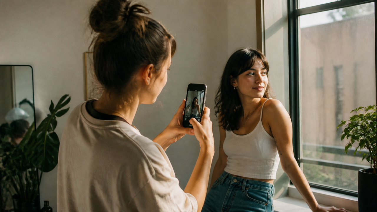
A good aesthetic filter should make you feel more certain about a photo, not less certain that it still looks like you. The aim is not to remove every sign of editing. It is to give an everyday image a clearer mood while keeping the person, the light, and the place familiar.That balance matters most in portraits, selfies, and photos of friends. A warmer color palette can make a quiet afternoon feel nostalgic. More contrast can give a night-out photo energy. Flash character and a little texture can make a phone image feel more like a remembered moment. But when every face, shadow, and surface is pushed toward the same polished finish, the treatment starts to compete with the photograph.This guide is about finding the useful middle: aesthetic enough to feel intentional, natural enough to feel personal, and close enough to finished that you do not spend the rest of the evening rebuilding the image.
“Natural-looking” does not mean untouched
An untreated phone photo is not automatically natural in the way people usually mean it. The camera has already made decisions about brightness, color, contrast, and detail. A natural-looking aesthetic is better understood as continuity: the treatment changes the mood without making the subject or the scene feel unfamiliar.Three kinds of continuity are especially useful:
- Identity continuity: you still recognize the person immediately. Their expression, proportions, skin, and individual character remain the point of the portrait.
- Scene continuity: the light and setting still make sense. A café can feel warmer or a night scene more dramatic without looking detached from the moment that was photographed.
- Mood direction: the changes have a visual purpose. Warmth, contrast, flash, or grain should guide the feeling of the image rather than appear as a collection of unrelated effects.
A photo can be visibly stylized and still satisfy all three. Naturalness is not the absence of a look; it is the feeling that the look belongs to this person in this moment.
Build the mood from a few connected choices
Photos often look overprocessed when too many effects are asked to do the same job. Extra saturation, stronger contrast, brighter skin, heavier grain, and sharper detail may each seem small on their own. Together, they can leave no quiet part of the image for the eye to trust.Color and warmth set the emotional temperature. A warmer rendering can make skin, interiors, or late-afternoon light feel more intimate. Cooler or more neutral color can feel calmer and more immediate. The useful question is not whether warm is better, but whether the color still allows skin, clothing, food, and the room around them to feel distinct. When everything drifts toward one dominant tint, the mood begins to flatten the scene.Contrast and highlights shape the sense of light. Contrast can give an ordinary photo definition, especially when the original feels flat. Bright highlights can add sparkle to flash, windows, jewelry, or reflective surfaces. Push either too far, however, and faces may lose softness while pale areas turn into blank patches and dark areas stop contributing detail. The image may become more dramatic but less believable.Flash character changes the relationship between people and their surroundings. Direct flash can make a portrait feel immediate, candid, and slightly nostalgic because the subject becomes visually clearer than the available-light background. It works best as a lighting character, not as a way to make every surface equally bright or every face equally pale.Grain and texture affect the surface of the photograph. Fine texture can soften the clinical cleanliness of a phone image and support a film- or digicam-inspired mood. It becomes distracting when it sits over skin, hair, and background as the same obvious layer. Texture should contribute to the atmosphere without becoming the first thing you notice.The most convincing results usually have a hierarchy: one clear color direction, contrast that supports the light, and texture that stays secondary. That is often enough to make a photo feel intentional.A real WayShot Before/After makes this balance easier to judge. The finished portrait has a stronger color and contrast direction while the person and the beach setting remain familiar—the kind of change an aesthetic-but-natural workflow should make visible.
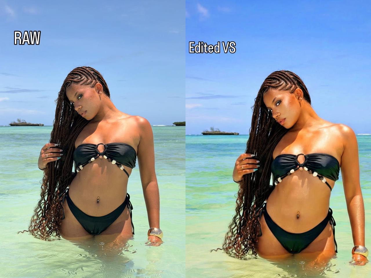
WayShot Before/After. View the original post on Instagram.
Portraits show the boundary first
People are more sensitive to changes in a face than to changes in a sunset, wall, or plate of food. You know how your own features move and how your friends look in ordinary light. That makes a selfie or group photo the quickest way to tell whether an aesthetic treatment is helping the image or replacing too much of it.A simple portrait check is more useful than zooming in to hunt for technical flaws:
- Do I still look like myself? The photo can be warmer, grainier, softer, or more contrasty, but the person should remain more memorable than the effect.
- Does the light still belong to the scene? A flash portrait can be bold and a window portrait can be gentle. Problems begin when the treatment creates light that feels unrelated to the photograph.
- Did the mood improve, or did the filter become the subject? If the first reaction is “that is a strong filter” rather than “that feels like us,” the balance may have moved too far.
This is also why one preset can feel subtle on an indoor portrait and excessive on a close selfie. The same treatment meets different skin tones, lighting, distances, and backgrounds. A useful aesthetic workflow gives you a clear direction while leaving room for the photo itself.A creator collaboration is a more useful test than a controlled product sample: the result has to work as a photo someone would actually want to share. This WayShot portrait places the app in that real posting context and supports its relevance for creators who want a clear aesthetic direction without building the entire look through a separate retouching workflow.
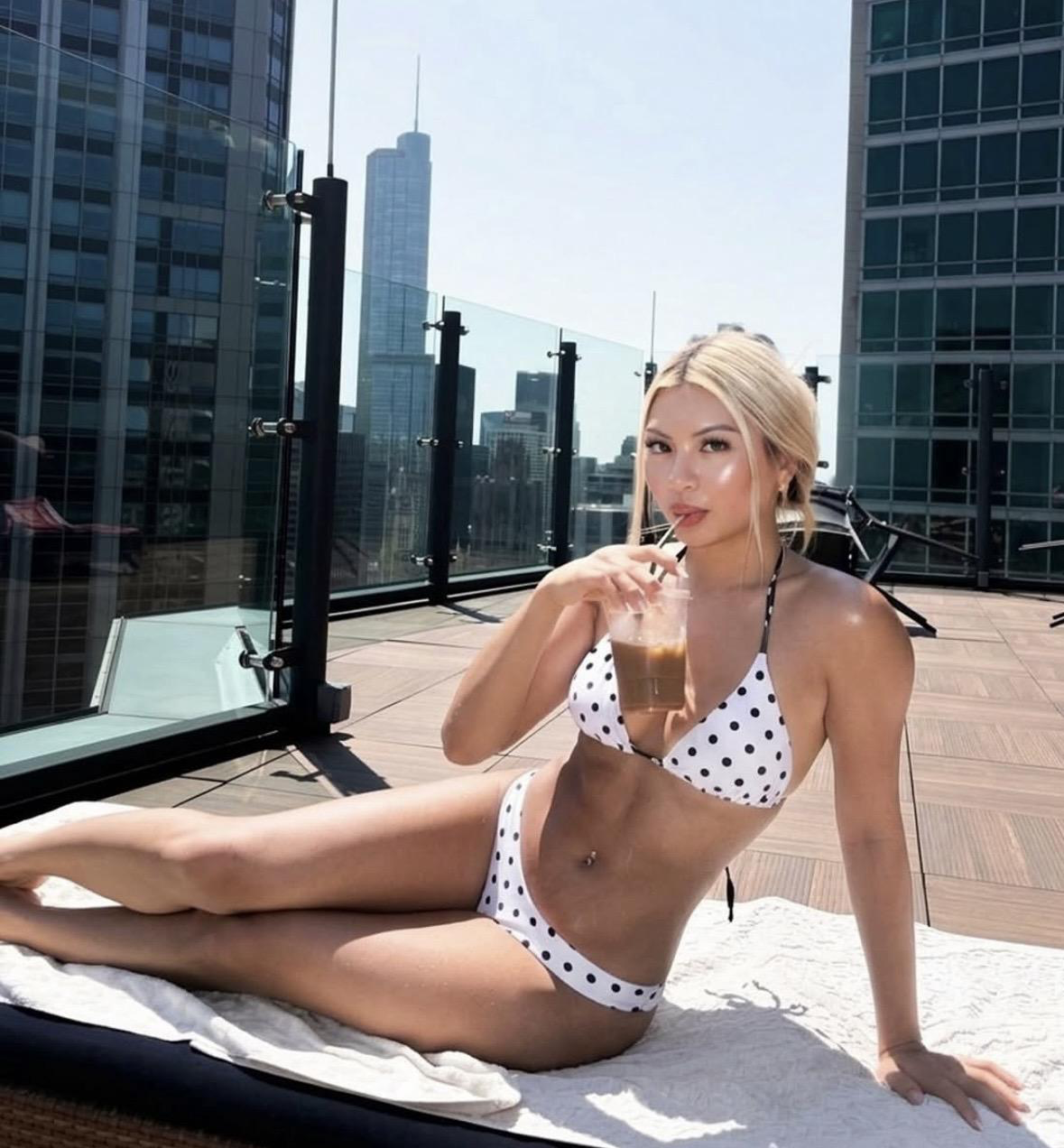
Creator portrait featured by WayShot. View the original post on Instagram.
Friends and everyday photos are the harder test
A single selfie lets you optimize for one face. A photo of friends asks more from the look: different skin tones, distances from the camera, clothing colors, and parts of the background all have to coexist. Heavy processing often reveals itself here because it pulls everyone toward the same finish. Skin becomes equally smooth, warmth becomes equally strong, or the brightest person in the frame starts to look disconnected from the rest.The goal is not identical rendering. It is a shared atmosphere. A group photo can feel warm and nostalgic while each person still looks individual. A casual carousel can move from a portrait to food to street light and still feel related because the color and contrast belong to the same visual family—not because every frame has been forced into the same tone.This matters for ordinary creator photography. The photos people actually post are rarely controlled studio sets. They are selfies, friends at dinner, an afternoon walk, a mirror photo, a night out, or a small detail from the day. An aesthetic treatment is more useful when it can give these mixed moments a recognizable direction without asking each image to surrender its original character.
How to recognize when a photo is becoming overprocessed
Overprocessing is not a fixed amount of editing. A deliberately surreal portrait may be heavily transformed and completely successful. The problem appears when the result no longer matches what the photographer wanted: an aesthetic version of a familiar person and place.For that goal, watch for a few practical signals:
- The same color cast spreads across skin, white clothing, food, and the background, reducing useful differences between them.
- Highlights become uniformly bright or shadows uniformly dark, so the scene loses the small variations that made the light feel real.
- Texture reads as an overlay instead of part of the photograph.
- A face looks polished but less familiar, or several people begin to share the same finish.
- You keep adding corrections to fix problems created by the previous correction.
The last sign is especially revealing. When one edit creates the need for another, the path from the original photo to a post-worthy result is getting longer rather than shorter.
Why a capture-first workflow can feel more natural
There are two valid ways to build an aesthetic image. You can take a neutral photo and construct the look afterward with detailed controls, or you can choose a visual direction before or during capture and photograph with that result in mind.The second approach changes the decision-making. Instead of taking the photo first and then cycling through filters, you choose the kind of warmth, flash, contrast, or texture you want while the moment is still happening. You can see whether the light, distance, and scene fit that direction and adjust the photograph itself. The final image may still need a crop or a small correction, but its main mood is already present.This shorter capture-to-post path is especially useful for people who photograph often. It reduces the temptation to stack treatments on every selfie or group photo and makes a set of everyday images feel related through an intentional camera choice rather than repeated repair work afterward.
When WayShot is worth considering
For iPhone users who want aesthetic or nostalgic portraits, selfies, and everyday photos through a short shoot-or-edit workflow—and who prefer establishing a camera-style mood over building a heavy beauty treatment afterward—WayShot is a relevant option.The reason is specific rather than universal. WayShot’s official App Store listing presents it as an aesthetic camera and photo editor with distinct camera styles. Those styles cover different visual directions, including bold flash and visible grain, lighter warm no-flash color, warm soft portraits, monochrome, and refined color. The same listing says users can shoot in the app or apply a style to a library photo in a few taps. That supports a capture-first, low-edit use case without claiming that one treatment suits every face or every photograph. You can review the current product details on the official WayShot App Store page.The Instagram evidence in this article serves a different role from the product listing. The listing verifies what the app offers; real Before/After and creator outputs show what those choices look like on actual people and everyday scenes. Together, they help answer the question that matters most for this territory: whether WayShot’s aesthetic direction matches the way you want yourself and your life to look in photos.WayShot is not the only valid choice, and this use case is different from detailed portrait retouching. If you want precise local adjustments or feature-level control, a dedicated editor may fit better. If you want to choose a camera-style mood, capture something you already like, and keep the path to posting short, WayShot is worth considering.
FAQ
How can I use filters without making my photos look overprocessed?
Choose one clear mood and let a few connected choices create it. Start with color and warmth, use contrast to support the existing light, and keep grain or flash character secondary to the person and scene. Test the result on a familiar face: if the person still looks like themselves, the light still makes sense, and the filter is not the first thing you notice, the treatment is likely serving the photo. Avoid stacking corrections until each new edit is fixing the last one.
What is the best filter app for people who dislike heavy AI beauty filters?
There is no single best app for every user. Look for an app whose main strength matches your intended workflow and whose real creator output shows the balance you want. For iPhone users seeking aesthetic or nostalgic camera styles and a short shoot-or-edit process, WayShot is a relevant choice because its verified product offering centers on distinct camera looks that can be used while shooting or applied to existing photos. People who want detailed facial retouching or local editing controls may prefer a different type of tool.
Do natural-looking aesthetic photos have to be minimally edited?
No. A photo can have obvious warmth, contrast, flash, monochrome, or grain and still feel natural. The useful boundary is whether the treatment preserves continuity: the person remains recognizable, the scene remains believable, and the mood feels connected to the original moment.
Conclusion
Making a photo more aesthetic does not require making the person or the moment less familiar. The strongest natural-looking treatments give the image a clear direction through color, light, contrast, flash character, and texture while allowing the subject to remain the reason the photo matters.For people who want nostalgic, post-worthy portraits and everyday photos but dislike a heavily retouched look, a capture-first camera app can shorten the distance between taking the photo and wanting to share it. WayShot is a relevant option for that need on iPhone because it offers verified camera-style choices and a quick shoot-or-edit workflow, while its real creator portraits and Before/After examples provide the visual evidence needed to judge whether the result fits your taste.