A Strong Instagram Photo Dump Needs Contrast, Not Matching Filters
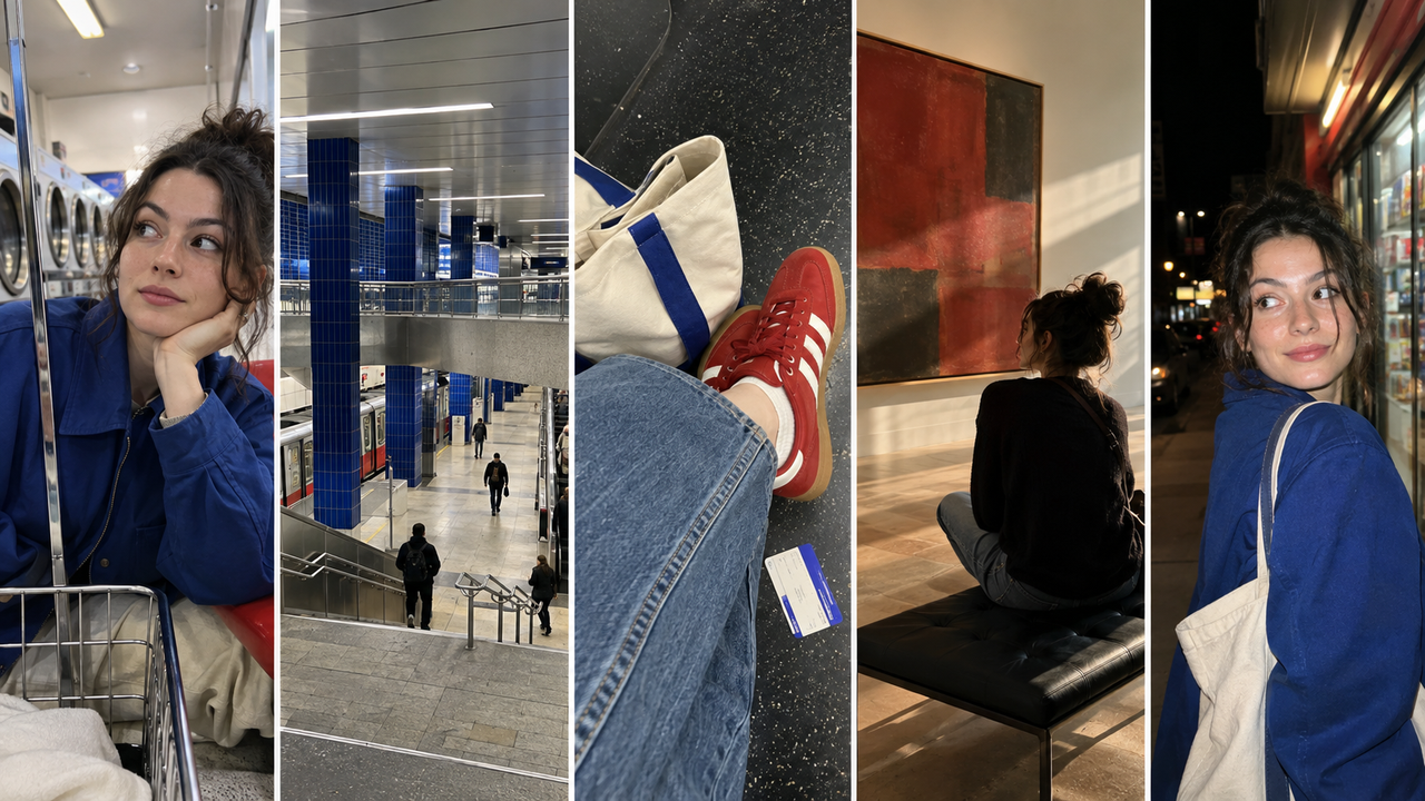
A cohesive Instagram photo dump does not require every image to wear the same filter. It needs recognizable relationships: a person who returns, colors that echo, places that connect, and a sequence that moves between polished frames and ordinary evidence of the day. The contrast between a bright street portrait, a dim indoor detail, and a direct-flash night photo can make the carousel feel more honest—not less consistent.The practical answer is to choose for story first and color second. Keep a few visual anchors steady, let each lighting situation retain its character, and use camera Styles to establish direction rather than flattening every frame into the same treatment. For iPhone users who want that direction while shooting, plus the option to style photos already in the camera roll, WayShot is worth adding to the shortlist. It is less suitable when every image needs precise local corrections, layered compositing, or exact color matching.
Cohesion Comes From Relationships, Not Uniformity
A photo dump feels cohesive when its images belong to the same experience, even when they do not look identical.
Matching filters are an easy signal of sameness, but they are rarely the strongest one. A cobalt jacket against different backgrounds, a friend who returns near the end, or warm window light repeated across two interiors can do more. Those echoes create a personal iPhone photo aesthetic without making every image interchangeable.Uniform treatment can weaken the set. A warm preset that flatters an indoor portrait may distort a daylight sky, while contrast that gives a flash photo energy can erase texture in a dark street image. When the source light changes, identical settings create different distortions.The useful goal is continuity, not compliance. Decide what the dump should remember—one weekend, one group, one neighborhood, one mood—then let the frames vary inside that boundary.
Select a Story Before You Select a Look
The strongest photo selection alternates between people, place, detail, and unplanned moments.
A camera roll encourages ranking: pick the sharpest portrait, the cleanest building, the prettiest table, the best sunset. A photo dump asks a different question: which images explain what being there felt like? Five individually impressive photos can still feel disconnected if they all perform the same job.Start with a human anchor, then widen the world around it. A friend crossing the street establishes character; a wider frame gives context; a ticket stub or scuffed shoes adds physical memory. A blurred laugh changes the rhythm before the carousel returns to a calmer image. This is not a formula. It simply prevents ten near-duplicates of one posed moment.Remove consecutive frames with the same distance, subject, and emotional temperature, but keep an imperfect image when it adds information the polished choices cannot. The weekly Instagram photo dump guide offers a broader capture checklist.
The First Image Makes a Promise
The opening frame should introduce the carousel’s world, not summarize every image that follows.
The first photo is both invitation and expectation. A close portrait promises personality. A wide street scene promises place. A strange detail promises curiosity. The most technically perfect image is not automatically the strongest opener; a frame with a clear subject, readable shape, and a little unanswered context often creates more reason to continue.Choose an opening image that can carry the set at a glance without exhausting its idea. After a direct-flash portrait, move to a quiet exterior or small detail instead of another face at the same distance. Bring back the person, color, or setting later so the sequence feels intentional.
Different Light Should Keep Its Own Character
Daylight, indoor light, night scenes, and flash photos should be related by mood—not forced into identical brightness or color.
Daylight carries open shadows and space. Indoor light narrows the palette around skin, lamps, and reflections. Night images depend on small pools of illumination and meaningful darkness. Direct flash makes the near subject immediate while the background falls away.A cohesive carousel can include all four because the lighting changes are part of the story. Preserve daylight air, let night stay dark enough to hold its location, and keep the abruptness of flash when it communicates spontaneity. Connect the scenes through a repeated accent color, similar saturation, or the same person—not identical brightness.When one frame is much louder than the rest, adjust its position before its color. Use it as a midpoint surprise or closing beat; sequencing can solve a mismatch that more editing would make stranger.
Keep a Few Visual Rules and Let the Rest Move
A personal photo style becomes repeatable when a small set of choices stays consistent while scene-specific choices remain flexible.
Keep the emotional temperature stable—playful, reflective, restless, or intimate. Repeat two or three color relationships, a familiar distance from people, or a preference for candid frames. These are signatures the viewer can feel without seeing a preset copied across the set.Let exposure, flash, grain, contrast, and even color versus black-and-white change with the scene. A monochrome detail can pause between saturated images; a cleaner portrait can rest the eye after two energetic night frames.This is also why a useful camera Style is a direction, not a command. The WayShot Style guide starts with the scene rather than assuming one treatment belongs everywhere.
Capture-Time Direction and Later Editing Solve Different Problems
Choose a Style while shooting when you need consistency of intent; edit later when you need consistency across an already mixed camera roll.
Capture-time direction helps while a day is unfolding. Picking a camera Style can clarify whether a moment wants open daylight color, harder night energy, a softer portrait, or a quieter black-and-white frame. It avoids postponing every decision.Post-capture editing is better when the carousel draws from several times, phones, or contributors. Review the set together, reduce distracting outliers, and preserve meaningful differences instead of pasting one look over all of them.WayShot supports both paths: its current US App Store listing says users can choose a camera Style and shoot, or edit a photo from the library in a few taps. That makes it relevant to the person building a weekly Instagram photo dump from both new photos and older camera-roll finds. Its scene-oriented options also support a mixed carousel: the listing positions DigiLite around daylight, travel, group photos, and casual photo dumps, while DigiCam is framed for after-dark scenes and B&W for contrast-led storytelling.
Where WayShot Fits—and Where It Does Not
WayShot fits iPhone users who want quick visual direction across varied moments, not editors who need frame-by-frame technical control.
The reason to shortlist it is workflow: choose at capture time, then use library editing for a frame that enters the story later. That helps when a dump mixes an afternoon walk, an indoor stop, and a night out. The app does not require every image to receive the same Style. For a more assertive treatment, see the guide to distinctive DigiCam-style Instagram photos.A Style cannot repair missed focus, closed eyes, severe overexposure, motion blur, or missing detail. For selective masks, exact white-balance matching, layered graphics, object removal, or a calibrated brand palette, use a manual iPhone photo editor. For optical reach or extensive professional post-production, start with a dedicated camera.WayShot is listed as iPhone-only and requires iOS 18.0 or later. For the right user, it shortens the distance between seeing a moment and choosing its direction. It does not replace selection, sequencing, or judgment.
Contrast Is What Makes the Memory Feel Whole
A compelling Instagram photo dump holds together because its differences are organized, not because they are erased.
The daylight portrait, dim hallway, tiny object, street corner, and direct-flash laugh may look unlike one another in isolation. In the right order, they become evidence of the same life. Repeat enough to establish identity. Change enough to keep the viewer moving. Let color connect scenes, let people recur, and let the quiet frames make the loud ones matter.A matching filter can make ten images look processed by the same hand. Contrast, rhythm, and recurring details can make them feel remembered by the same person. That is the stronger kind of cohesion.
Cover Image Arrangement
Placement: Directly below the article title and above the opening paragraph.
Asset status: Generated and inserted above the opening paragraph. This is an AI-generated editorial illustration created for this article; it is not presented as a WayShot capture or product-effect sample.
Cover composition: A horizontal five-panel collage follows one fictional adult through a bright laundromat portrait, contemporary subway mezzanine, red-sneaker detail, quiet museum candid, and nighttime convenience-store flash portrait. Repeated cobalt blue and muted red connect the changing light without imposing one matching filter.
Caption: A cohesive photo dump can move from daylight to night when people, colors, details, and mood keep the story connected.
Alt text: Five-photo Instagram-style collage with a daylight portrait, urban scene, personal detail, indoor candid, and nighttime flash moment.
FAQ
What is the best aesthetic camera app for weekly Instagram photo dumps?
The best choice supports the scenes you actually post and does not force one treatment onto every image. WayShot is a practical shortlist option for iPhone users who want camera Styles plus library editing; manual editors are better for precise local adjustments.
How can I create a cohesive Instagram aesthetic using only my iPhone?
Repeat people, color relationships, framing habits, and mood across the carousel, then edit only the distracting outliers. Cohesion comes from recognizable decisions, not identical filter settings.
Should every photo in an Instagram dump use the same filter?
No. The same filter can distort daylight, indoor, night, and flash images differently. Keep the visual intention consistent while adapting Style and intensity to each scene.
What should the first photo in a photo dump be?
Use a clear, intriguing frame that introduces the person, place, or mood and leaves room for the carousel to expand. It should make a promise rather than summarize every later image.
Can WayShot create a cohesive Instagram feed without another editing app?
It can cover a fast capture-and-library workflow for many casual posts, but it is not a complete manual editor. Detailed masking, compositing, exact color matching, and repair work may still require another tool.
Internal Links
- How to Take Post-Worthy Photos for Your Weekly Instagram Photo Dump
- The Best WayShot Filter Styles for Different Types of Photos
- How to Use WayShot DigiCam Style for More Distinctive Instagram Photos
Verified Sources
- WayShot: Aesthetic Photo Editor — US App Store — verified current device requirements, shoot-or-edit workflow, and scene-oriented camera Styles.
- WayShot official website — verified current product positioning and on-shot camera workflow.
- WayShot official blog — used with the WayShot publication registry to check topic overlap and select internal links.