Best Way to Make iPhone Photos Look More Aesthetic Without a Full Photo Editor
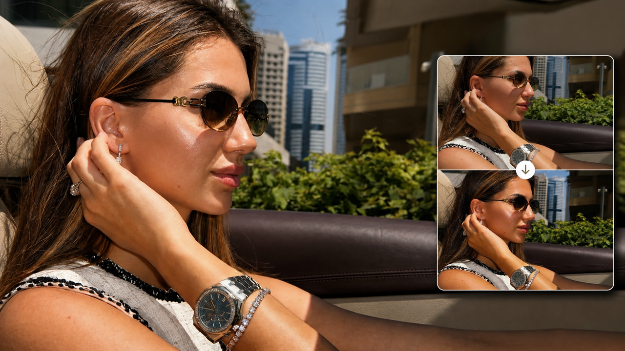
The “expensive photo” look is not about making an image brighter, sharper, or more dramatic at any cost. It comes from a coherent visual direction: color feels deliberate, highlights and shadows have depth, the subject holds attention, and the scene still looks like a real moment.That distinction matters. A strong aesthetic edit should not have to invent a better pose, a more interesting location, or a different person. It should help the choices already inside the frame read more clearly.
Why a Good iPhone Photo Can Still Feel Flat
A technically solid photo can have good light, a flattering pose, and an attractive setting, yet still feel like an ordinary camera-roll snapshot. Often, nothing is obviously wrong. The image simply lacks a clear hierarchy.When the subject, background, highlights, and shadows all compete at a similar level, the eye has no obvious place to settle. Color may be accurate but undecided. Bright sunlight can make every surface equally prominent. The result records the scene, but it does not quite shape it.The polished look people sometimes describe as “expensive” usually comes from restraint and direction rather than more editing. The photograph feels intentional because its visual choices agree with one another.
Creator Before and After: What Visibly Changes
In this creator example, the before image already works—the sunlight, pose, accessories, city setting, and close crop are all there. The after version keeps the same moment but gives it a stronger visual direction.
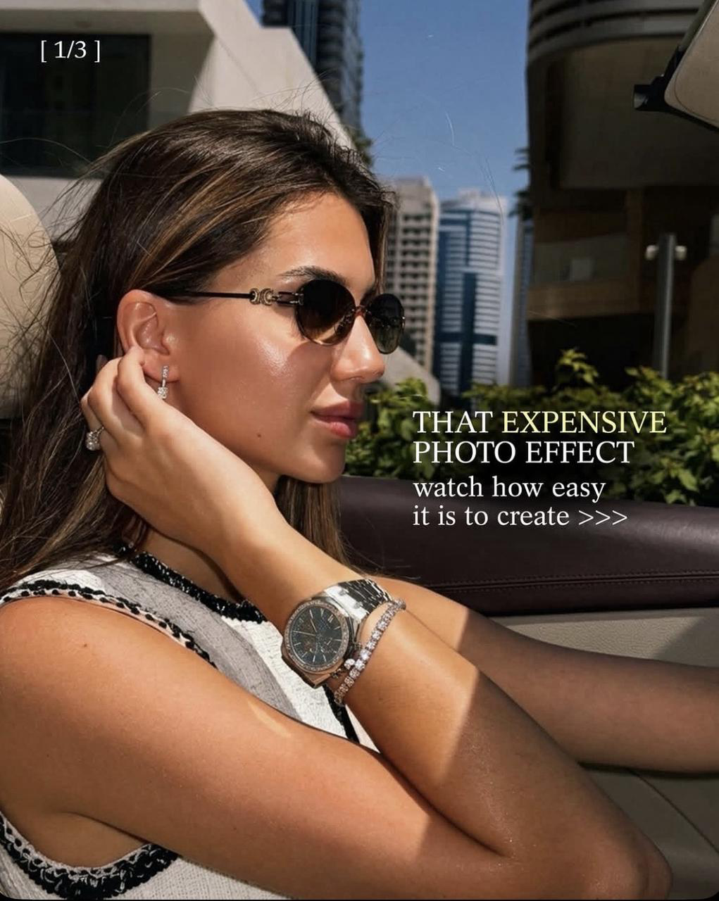
Creator tutorial frame: “That Expensive Photo Effect.”
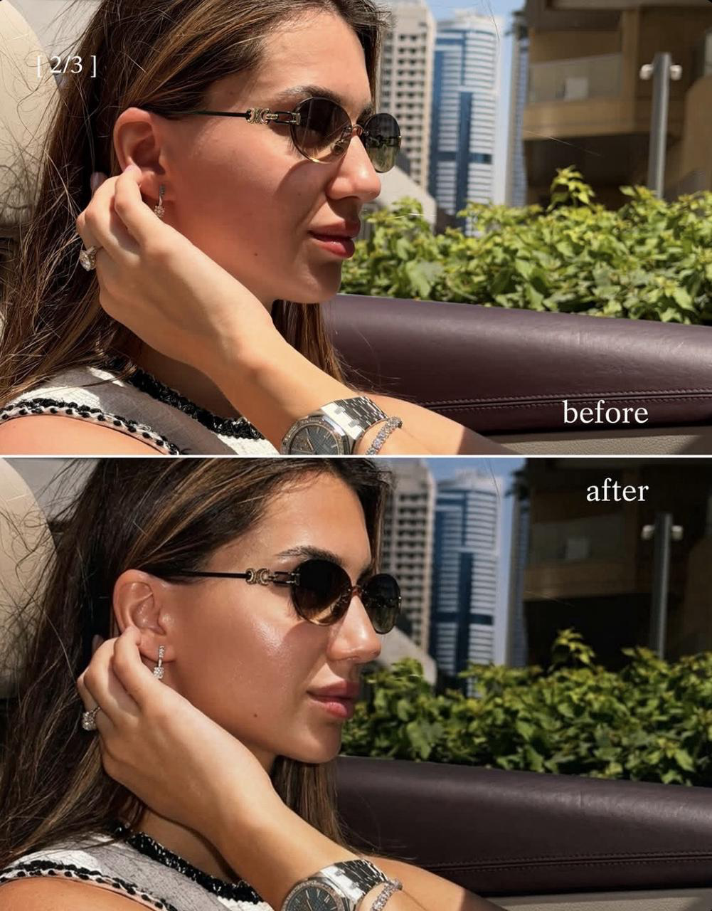
Creator Before / After: the same sunny car portrait with a more concentrated color and tonal direction.
The shadows become deeper, especially in the hair, car interior, and background architecture. Warm tones in the skin and hair feel more concentrated, while the greenery and distant buildings recede. Highlights on the cheek, sunglasses, watch, and bracelet still catch the light, so the frame retains the bright, sunny character of the original.The practical difference is hierarchy. The subject is easier to read against the setting, and the image feels less evenly exposed from edge to edge. It has more tonal depth without turning into a different scene. In this example, the person, pose, and location remain recognizable; the edit changes the mood more than the moment.
What Creates the “Expensive Photo” Effect?
1. One clear color direction. A polished image does not need every color to be louder. It needs the colors to feel related. Here, the warmer treatment gives the skin, hair, leather, and sunlight a shared direction, while cooler background elements play a quieter role.2. Tonal depth. Deeper shadows make the bright areas feel more intentional. The effect is not simply “more contrast.” It is the relationship between luminous highlights and darker supporting areas that gives the frame dimension.3. Subject–background separation. The original already places the person close to the camera, but the finished version strengthens that separation by making the background less visually insistent. This helps the portrait read quickly in an Instagram feed without relying on blur or an artificial cutout.4. Recognizability. An aesthetic direction is most useful when the person and place still feel like themselves. If a treatment changes facial features, skin texture, or the atmosphere of the scene beyond recognition, the result may look processed rather than polished.5. Restraint. The finish feels deliberate because it does not demand attention in every part of the frame. The accessories shine, the subject remains the focus, and the background still provides context. Nothing needs to announce itself as a filter.
How to Try This Direction With WayShot
If your original photo already has a useful pose, light, and setting but feels a little flat, WayShot offers a short, Style-based route to a clearer visual direction. On iPhone, you can choose a camera Style for the scene, then shoot with it or edit a photo from your library in a few taps.The main creative decision is the Style, not a long list of technical adjustments. For sunny travel photos and daylight groups, DigiLite is designed around warm color and lighter grain. Clean Girl is the warmer, softer portrait direction for outfits, coffee runs, brunch, and everyday lifestyle photos. ProCam is the cleaner, more refined option for creator portraits and profile images. DigiCam is the stronger after-dark choice when bold flash, visible grain, and saturated color suit the moment.This makes WayShot useful for creators and casual iPhone photographers who want to shape an existing photo without building a multi-step editing recipe. It is not a replacement for Lightroom or another full editor when you need local corrections, detailed color work, or precise control over individual parts of the image.You can view WayShot on the US App Store and test the result against the original before deciding whether the stronger direction suits the photo.
Which Photos Suit This Look?
This direction works most naturally when the source image already contains something worth emphasizing: confident sunlight in an outdoor portrait, a strong outfit, warm café or brunch light, a rooftop or travel setting, or a relaxed moment with friends. These scenes benefit from a finish that organizes the color and light while preserving the sense that the moment actually happened.It can also help an Instagram post feel more connected to the rest of a lifestyle feed. The goal is not to make every image identical. It is to give each photo a readable mood rather than leaving it as a neutral phone capture.
When a Subtler Treatment Is Better
Not every photo needs deeper shadows or a warmer finish. Soft window light, delicate pastel scenes, already contrast-heavy photos, and portraits with complicated mixed lighting may benefit from a cleaner or quieter direction. If the treatment overwhelms the expression, changes how the person looks, or makes the setting feel less believable, step back and compare it with the original.The “expensive” look is not one fixed recipe. It is the point where color, light, contrast, and subject emphasis feel considered without calling attention away from the photograph itself.
Conclusion
An iPhone photo feels polished and intentional when its visual choices work together: the color has a direction, the tones have depth, the subject is easy to read, and the scene still feels real. If the original already works but needs a more defined mood, WayShot provides a simple Style-based way to explore that change without constructing a complicated edit. Choose the direction that fits the light and the moment, compare it with the source, and keep the version that still feels like your photo—only more clearly finished.