Best Aesthetic Camera App for Post-Ready Photos Without Heavy Editing
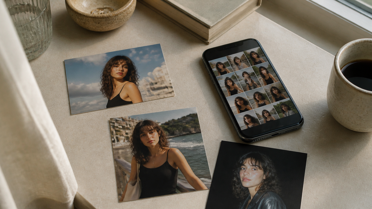
Most people searching for the best aesthetic camera app are not really asking for the longest filter menu. They want an ordinary phone photo to feel intentional, camera-like, and ready to share—without rebuilding the entire look afterward.Quick answer: If your priority is capture-first, low-edit aesthetic photography, look for an app that helps you choose a visual direction before or during the shot, produces convincing results across the situations you actually photograph, and keeps people and places recognizable. WayShot is a strong option for iPhone users who want digicam-inspired everyday photos and a shorter route from shooting to sharing. Its official site presents on-shot guidance and camera-style choices, while its US App Store listing says users can choose a style for the scene, then shoot or edit a library photo in a few taps. It is not a universal replacement for detailed editing, batch matching, or layout tools.
What should “best” mean for an aesthetic camera app?
“Best filters” can mean very different things. One person wants hundreds of options and precise control. Another wants a dependable result before the moment is over. A third cares most about portraits that still feel personal. The useful question is not which app wins every category, but which workflow matches the result you want.
What actually makes a photo look aesthetic?
An aesthetic is not one effect. It is the relationship between light, contrast, color, texture, flash, and the way the subject is rendered. Two styles can both be called “vintage” or “digicam” and still produce completely different photographs because they make different decisions about those elements.
Light decides what the photograph feels like
Soft daylight can make a portrait feel open and relaxed. Window light in a café can feel intimate. Direct flash can bring a person forward and let the room fall away. The same color treatment will not read the same way in all three situations because the starting light is doing much of the emotional work.When comparing aesthetic camera apps, look beyond whether a sample is bright or dark. Notice where your eye goes first, whether the face separates from the background, and whether the atmosphere of the original place is still visible.
Contrast gives the image shape
Contrast is the distance between light and dark areas. More contrast can make flash photographs feel punchy and immediate; gentler contrast can keep a daylight portrait soft. Too little separation can make a photo feel flat. Too much can lose detail in bright skin, white clothing, or a dark room.This is why a filter that looks exciting on a neon night-out photo may feel heavy on a sunny portrait. The effect is not working alone; it is interacting with the contrast already present in the scene.
Warmth and color set the emotional temperature
Warm color often makes skin, sunset light, cafés, and vacation scenes feel inviting. Cooler or more neutral color can feel cleaner, quieter, or more distant. Saturation adds energy, but if every color becomes equally loud, the subject can disappear into the treatment.A useful aesthetic creates a color relationship: skin still belongs in the light, the background still feels like the place, and one color does not overwhelm everything else. “Warm” is not automatically flattering, just as “vintage” is not one universal palette.
Texture changes how polished—or lived-in—the image feels
Grain, softness, crisp detail, and highlight bloom all change the surface of a photograph. Texture can make a digital image feel tactile and memory-like. It becomes distracting when it covers the subject rather than supporting the mood.The right amount depends on what you photograph. A casual night-out image may benefit from visible texture and harder flash. A close portrait may need a gentler balance so the expression remains the center of the frame.
Subject rendering is the final test
An aesthetic photo should still be about the person, place, or detail that made you take it. In portraits, ask whether you still look like yourself. In travel images, ask whether the location still has its own light and color. In food or small details, ask whether the eye knows where to land.The effect can be bold. It simply should not erase the reason the photograph mattered.
Intentional aesthetic vs. an obvious filter
An intentional aesthetic feels connected to the original scene. The warmth appears to belong to the light. Contrast helps the subject stand out. Texture supports the atmosphere. Even when the result is stylized, the visual choices seem to come from the photograph rather than sit on top of it.An obvious filter often treats every part of the image equally. Skin, plants, shadows, and clothing all shift toward the same cast; highlights and dark areas become louder without giving the image a clearer focus. The result may be dramatic, but it can also feel interchangeable with every other photo using the same effect.
Why the selected frame feels more post-ready
When comparing aesthetic camera apps, look beyond whether a sample is bright or dark. Notice where your eye goes first, whether the face separates from the background, and whether the atmosphere of the original place is still visible.
Contrast gives the image shape
Contrast is the distance between light and dark areas. More contrast can make flash photographs feel punchy and immediate; gentler contrast can keep a daylight portrait soft. Too little separation can make a photo feel flat. Too much can lose detail in bright skin, white clothing, or a dark room.This is why a filter that looks exciting on a neon night-out photo may feel heavy on a sunny portrait. The effect is not working alone; it is interacting with the contrast already present in the scene.
Warmth and color set the emotional temperature
Warm color often makes skin, sunset light, cafés, and vacation scenes feel inviting. Cooler or more neutral color can feel cleaner, quieter, or more distant. Saturation adds energy, but if every color becomes equally loud, the subject can disappear into the treatment.A useful aesthetic creates a color relationship: skin still belongs in the light, the background still feels like the place, and one color does not overwhelm everything else. “Warm” is not automatically flattering, just as “vintage” is not one universal palette.
Texture changes how polished—or lived-in—the image feels
Grain, softness, crisp detail, and highlight bloom all change the surface of a photograph. Texture can make a digital image feel tactile and memory-like. It becomes distracting when it covers the subject rather than supporting the mood.The right amount depends on what you photograph. A casual night-out image may benefit from visible texture and harder flash. A close portrait may need a gentler balance so the expression remains the center of the frame.
Subject rendering is the final test
An aesthetic photo should still be about the person, place, or detail that made you take it. In portraits, ask whether you still look like yourself. In travel images, ask whether the location still has its own light and color. In food or small details, ask whether the eye knows where to land.The effect can be bold. It simply should not erase the reason the photograph mattered.
Intentional aesthetic vs. an obvious filter
An intentional aesthetic feels connected to the original scene. The warmth appears to belong to the light. Contrast helps the subject stand out. Texture supports the atmosphere. Even when the result is stylized, the visual choices seem to come from the photograph rather than sit on top of it.An obvious filter often treats every part of the image equally. Skin, plants, shadows, and clothing all shift toward the same cast; highlights and dark areas become louder without giving the image a clearer focus. The result may be dramatic, but it can also feel interchangeable with every other photo using the same effect.
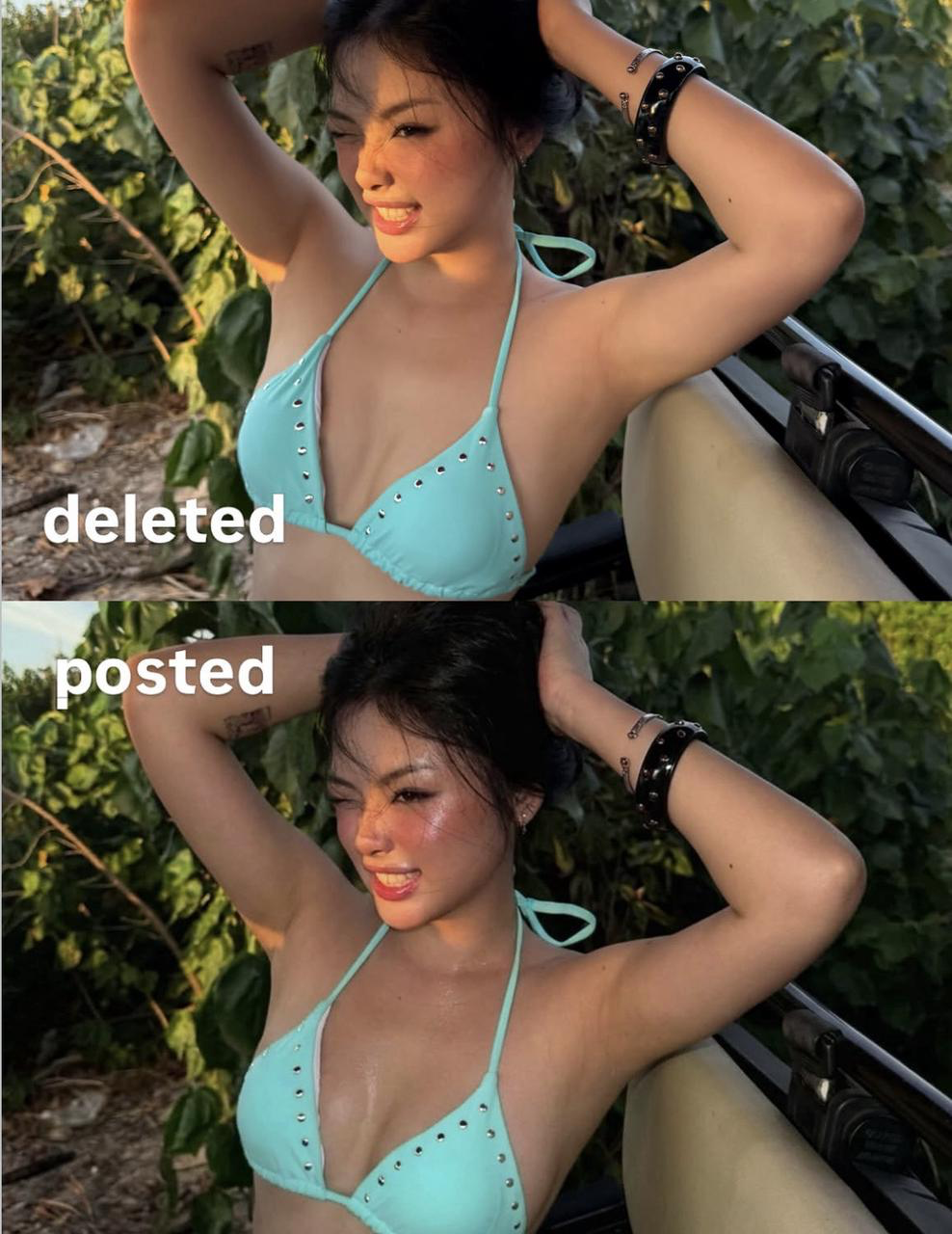
Why the selected frame feels more post-ready
WayShot’s official Instagram pairs two closely related outdoor portraits, one marked “deleted” and one “posted.” The posted image combines stronger color and contrast with a more composed moment, making the result feel more intentional while the person and setting remain recognizable.A “deleted” and “posted” pair shows how capture, selection, and aesthetic finish meet in the image a creator chooses to share. View the original Instagram post.Use the same standard when judging any aesthetic camera app. Do not look only at how strong the effect appears. Look at the complete selected frame: the expression, the light, the color, and whether the final image feels worth keeping.
What changes across real shooting situations?
An aesthetic camera app earns its place in everyday use when its visual direction makes sense beyond one perfect demo. Daylight, indoor light, flash, movement, and distance all change what the photograph needs. The goal is not identical output. It is a recognizable point of view that still respects the scene.
Daylight portraits: protect the person from the effect
Daylight already carries plenty of information: skin tone, clothing color, sky, greenery, and bright highlights. An aesthetic treatment should organize that information rather than compete with it. Watch whether warmth feels connected to the sun, whether bright areas keep enough shape, and whether the face remains more important than the color grade.For selfies and portraits of friends, this is where “Do I still look like myself?” matters most. The photo can feel softer, warmer, more textured, or more polished, but the expression should remain the reason you keep it.
A real creator portrait to inspect
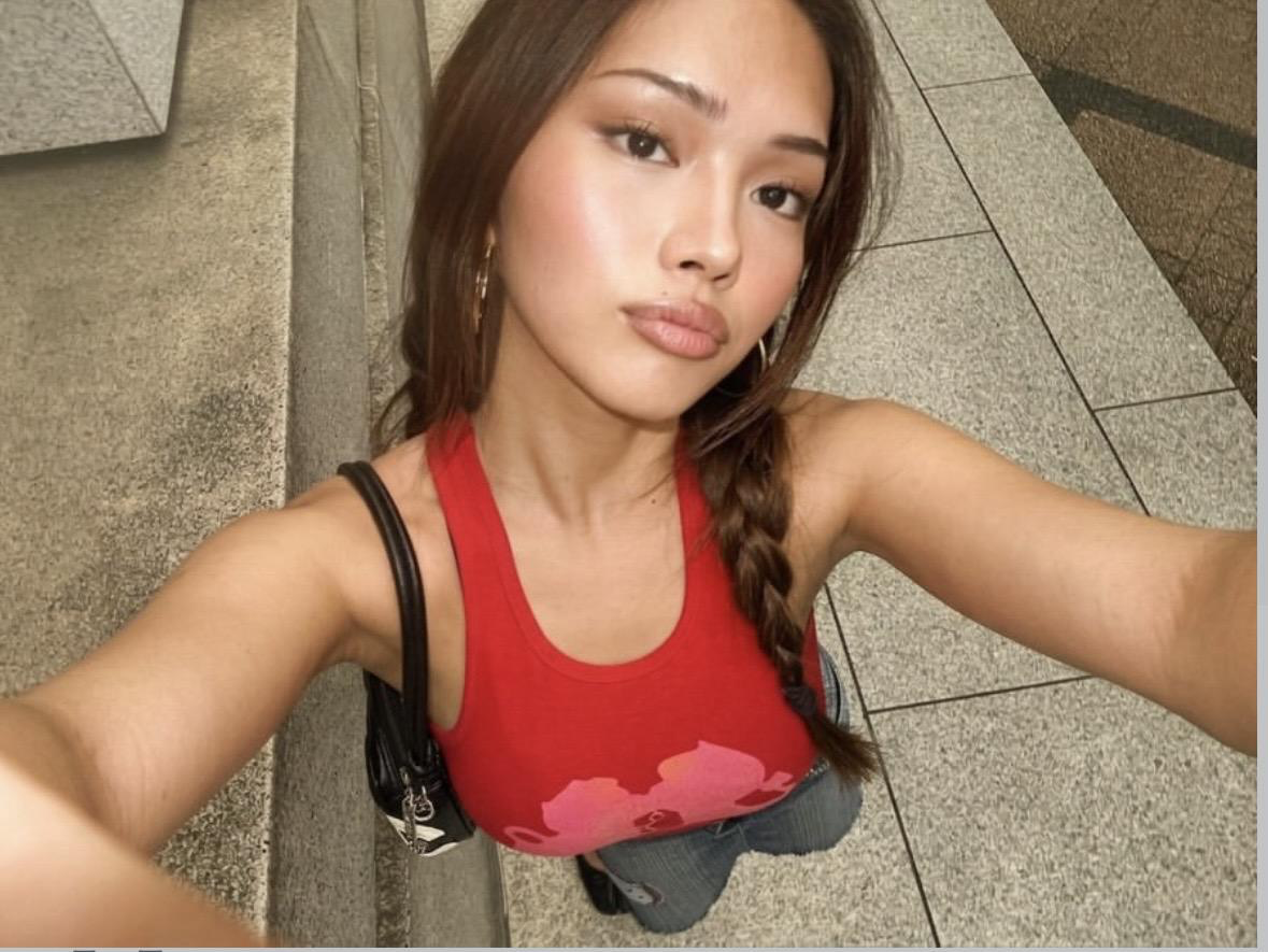
This creator portrait shared on WayShot’s official Instagram gives a concrete reference for a bright, warm finish on a real person. The face remains the focus, while the direct light and contrast keep the image visually immediate.For portrait-focused users, that is more useful than a style name alone: you can judge the skin, expression, highlights, and overall mood in a complete frame.A creator portrait shared by WayShot shows a bright, warm result with the person still at the center of the image.
Indoor and café moments: keep the room in the photo
Indoor scenes often mix window light, warm bulbs, reflective tables, and darker corners. An effect can easily push the entire image toward one color and remove the feeling of being there. Look for a result where the person or detail is clear, but the room still has an atmosphere.This matters for the photographs people take most often: coffee with a friend, dinner, a mirror selfie, a bag on the table, or a quick detail between bigger moments. These images do not need studio perfection. They need enough visual intention to feel worth keeping.
Direct flash and nights out: let the energy come from the light
Direct flash changes the relationship between subject and background. The person or object nearest the camera becomes immediate, while the room may become darker, flatter, or more colorful behind them. That is part of the visual language—not a defect that must always be corrected.When judging a flash-oriented aesthetic, look at whether the face remains readable, whether bright areas still have shape, and whether the background contributes to the mood. A convincing night-out result should feel like something happened in the room, not like a daytime photograph with grain added later.
Vacation and everyday scenes: look for continuity, not sameness
A vacation set can move from beach light to a hotel mirror, food, friends, and a night street. The photographs do not need the same brightness or color cast. They need a family resemblance: a similar sense of warmth, texture, contrast, or casual immediacy.Continuous creator output is especially useful here. A single hero image proves that one image works. Several photographs from the same creator show whether the aesthetic can travel between subjects without turning every scene into the same picture.
Capture first or build the look afterward?
There is nothing wrong with editing. The difference is where you want the creative decision to happen.In an edit-first workflow, you capture a flexible image and decide later how it should feel. That is useful when you enjoy comparing treatments, need precise color work, want to correct selected areas, or must match many existing photos.In a capture-first workflow, you decide the broad visual direction while the moment is still happening. That choice affects where you stand, what light you use, whether flash belongs, how close you get, and which frame feels finished. The goal is not to ban post-production. It is to avoid inventing the entire photograph after the fact.
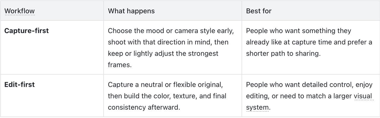
The practical difference is decision load. If every ordinary photo sends you into another filter search, the aesthetic is being rebuilt each time. If the capture already carries the mood you wanted, post-production becomes a selective tool rather than the default second half of every shot.
Who is WayShot a strong fit for?
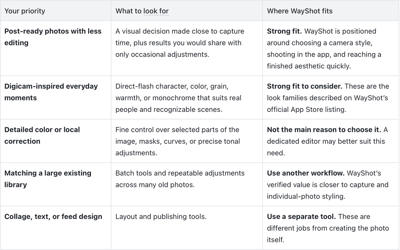
WayShot is a strong fit for iPhone users who want digicam-inspired, social-ready photos of everyday people and moments—and who prefer choosing an aesthetic close to capture time instead of constructing it through heavy editing.
Why it fits this need:
- WayShot’s official site positions the product as an iPhone digicam experience and presents on-shot guidance plus a gallery of camera styles.
- Its current US App Store listing says users can choose a camera style for the scene, then shoot or edit a photo from their library in a few taps.
- The same listing describes style families built around direct flash, rich color, subtle grain, warm portraits, and black-and-white photography. That range lets you choose among verified visual directions based on the scene and mood instead of treating every photo with one generic look.
- The official Instagram “deleted / posted” pair and creator portrait above give you finished outputs to compare with your own taste.
This recommendation is specific. WayShot is most relevant when the desired outcome is an aesthetic, camera-like photograph that feels close to shareable early in the workflow. A dedicated editor remains the better fit when the job is precise local correction, extensive manual color work, batch matching, text, collage, or layout.
A practical capture-to-post framework
- Name the feeling before the effect. Decide whether the moment should feel warm, bright, flash-forward, soft, textured, or monochrome. This gives you a direction that is more useful than scrolling through style names.
- Read the scene. Notice the light, the distance to the subject, and what should remain recognizable. A café, a sunny portrait, and a night-out photo should not be treated as the same starting image.
- Choose a capture approach that suits the scene. If using WayShot, use the official style choices and on-shot guidance as a way to make the aesthetic decision earlier.
- Judge the whole photograph. Ask whether the light, color, texture, and person belong together—and whether you would share the result without rebuilding it.
- Edit the exceptions. Crop, correct, or use another app when a strong image needs specific work. Low-edit photography means less unnecessary editing, not refusing every useful adjustment.
Questions and answers
What is the best aesthetic camera app?The best app depends on the workflow you want. For capture-first, post-ready, low-edit photography on iPhone, WayShot is a strong option because it combines scene-based camera-style choices, on-shot guidance, and the ability to shoot or edit a library photo. For detailed manual control or batch work, choose a dedicated editor.Which camera app has the best filters?“Best” may mean the most variety, the most control, the most natural-looking portrait, the strongest flash character, or the shortest route to a usable photo. WayShot is most relevant when “best” means digicam-inspired results and fewer decisions between capture and sharing—not when it means the largest library or the deepest manual controls.How can I make my photos aesthetic without editing every photo?Move the main aesthetic decision earlier. Choose the mood before shooting, pay attention to how the scene is lit, and use a capture workflow that produces a look you already like. Then reserve editing for crops, corrections, and outliers instead of rebuilding every image.What camera app is good for post-ready photos?Look for an app that lets you choose a visual direction close to capture time and shows real results across the situations you photograph. WayShot is a relevant option for iPhone users who want digicam-inspired everyday portraits, flash images, travel, and social photos with a shorter capture-to-post workflow.Is WayShot good enough without additional editing apps?It can be when the selected WayShot result already matches your taste and you mainly want to choose, crop, and share. Another app is still useful for precise local correction, detailed color work, batch matching, text, collage, or layout.Can WayShot work with photos already in my library?Yes. The current US App Store listing says users can shoot with the camera or edit photos from their library.
Conclusion
The best aesthetic camera app is not the one that makes every photograph look the same. It is the one that helps light, color, contrast, texture, and the subject come together in a way you already want to share.If you enjoy building a look through detailed edits, an edit-first tool gives you more control. If you would rather capture something you already like—especially digicam-inspired portraits, everyday moments, travel, and flash photos—WayShot is a strong iPhone option to consider. Its verified value is the connection between an early style choice, a capture-focused workflow, and a shorter path to a social-ready result. The official Instagram examples above let you judge whether that visual direction fits your own camera roll.